
Wednesday, 27 April 2011


Monday, 25 April 2011


Friday, 15 April 2011


Wednesday, 6 April 2011
FINISHED FRONT COVER;

After spending a few hours on Adobe Indesign and PaintShop Pro, this is what I have created as my final front cover of my magazine.
I am happy with the over all look and layout of this but I do think there are things i could change; Putting a colour on the background, changing the colours and look of the names of the artist on the bottom right as i dont think it really works as effectively as it could with the overall front cover. I think the main image works well and stands out on the page and also the sell lines and pull quotes all go nicely with the image too. I do like the 'EXCLUSIVE' and circle as it makes everything stand out as its really bold and also the picture and masthead catches the readers eye. Overall, I am happy with m front cover but could've dont with making a few changes to it to make it even better.
Sunday, 20 March 2011
FINISHED CONTENTS PAGE;


This is my contents page and it is mainly finished.
To completely finish it I am thinking of adding a few extra details to see if they look effective on the page but if not then I am happy with this as my overall contents page.
I am pleased with how it looks as it look just like i wanted it to from when i did my rough idea on the paper draft of it. It includes the important details like the date, page numbers, and also the picture is bold so it makes the page stands out and the subsidiary pages look nice on the page too, adding colour to it.I like the writing around the outside as it give a symmetry to the page and I think the colours work well together too.
Overall, I am really pleased with the end product of my contents page.
Wednesday, 9 March 2011


Sunday, 6 March 2011
Final Planning of My Contents Page;

This is exactly what my contents page is going to look like when I start working on Adobe Indesign to construct it. I have taken some ideas from both of the two initial ideas I did at first and put them together to make this one above. I think it is an effective layout as it has a mixture of text and pictures and I think it does look like a contents page.
Tuesday, 1 March 2011

Drafts Of My Own Contents Pages;

This is the first draft that I made of my own contents page.
I think the layout looks quite effective as it invilves both
pictures and texts and it looks quite busy.
It has different shapes on it which also gives it a variety which
makes it more interesting to look at.
I think the idea of a collage is effective at catching the eye of the reader.

This is my second attempt of creating my own contents page.
Personally, I prefer this one to the one above as I think the whole layout
goes together a lot better and looks a lot more balanced with the picture in
the middle and the boxes with writing on the outside.
Still, I may take some ideas from the top one too and incorporate in this
one to try and make it the best that I can.
Sunday, 27 February 2011
Examples of Music Magazine Contents Pages That I Like;

I like this contents page as it is a simple layout with just one big main image but i think it makes the page look effective and neat by doing so. The colours are quite plain and simple but also do go together rather way and i think that the writing down the side gives it a really positive look to the page. With it being more plain and simple, it makes it easier to read and get the infortmation the you want.

I like this contents page as it looks really busy showing things that are inside the magazine which would more likely make me want to read it. I like the colour schemes as the colours all stand out and the big pictures and numbers make the page look really bold. I also like how the way the writting is listed down the sides along with the pictures in the middle, it looks effective for a layout.

I really like this contents page as the layout is really effective. I likw how all of the pictures provide a lot of colour to the page against the grey and black background and I like how they almost make a collage. It looks really neat and all fits together nicely making the page stand out showing all of the different things in the magazine. On each picture there is a page number which lets the reader know where to find eveerything so it makes it a lot quicker and better for the reader as it gives the reader an insite on what to expect.
Wednesday, 9 February 2011
2nd Draft of My Magazine Article
- Finished

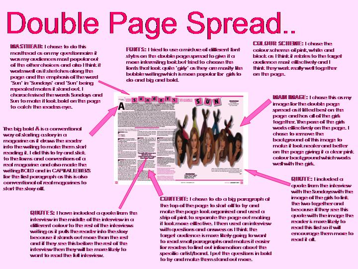
This is what I have produced after a few more hours work on my article.
I am really pleased with the work that I got done in a couple of hours and it is looking really good.
I have changed my masthead and now it looks a lot more effective and really stands out on the page as the squares come off the page and the letters in them are bold drawing the readers eye into it.
I have included different colours in the article page to make it catch the eye of reaaders instead of it all just being text and I think I have done that well as the spalsh of colour make it look a lot better with all the text that is on the page. The picture page looks really good too as I have made them have a drop shadow so they stand out off the page and the text around them just makes it more bold too. The masthead joins both of the pages together. I am really pleased with how it is looking here.
1st Draft of My Magazine Article;

This is what I produced after the first session of working on my magazine article.
I am really pleased with how it is looking and I think the look is quite effective as all of the clours work well together, the picture stands out nicely on the page, and I have got the pull quote, page numbers, date, website and the amsthead included too. I am happy with the way that it is layed out but more work isw needed on the page with the picture on and also the masthead needs to be worked on to make it look a lot better which I will do on my next time in the computer room.
First ideas For My Article;

I like the layout of this article as I think the heading going over both pages will join both pages together.
Also I like the layout of having the picture on one page and the writing on the other. The heading should draw the reader in as it will be bold and big making them want to read it.
It includes everything it needs to, page numbers, masthead, pull quote etc so I think it is an effective layout.

This layout, I think, is the most effective layout for my article. I like the heading as it goes over both pages joining them together. Also the big 'A' will draw the reader into the page as its bold and stand out. It has all the necessary details on it that it needs and also it has to traditional layout of picture on one page and the article on the other one. The picture also has a quote on which is quite frequently used in Qmagazine so it looks effective.
Example of Magazine Articles that I Like;

I really like the layout of this article with the picture on the right and the writing in 3 collumns on the left. I like the colour scheme as green white and black go really well together. I also like how the heading makes the article stand out as it is big and also the big 'P' draws the reader in. A very effective way of creating a double page spread.

I like this article as I like the way that the picture overlaps the page as it is large and makes the page stand out and look bold. The large writing by the picture also draws the reader. The colours are very plain but it still makes the page look really effective.

I really like this article as I like how the heading is done differently with the words as it stands out on the page. The colours black and white make the page look bold and it looks different. I also like the way the main image and the masthead overlap both of the pages so that it creates a joining of both pages and also, both are quite large make the page stand out.
Subscribe to:
Comments (Atom)