MY PHOTO SHOOT PHOTOS.
On My Photo Shoot, I tried to get the best pictures I could and the type of pictures i was aiming for. I found it a bit difficult because there wasn't much space and the lighting wasn't the best. I got a variety of pictures and I got quite a few of each. I tried thinking of different camera angles and different poses for the models to give it variety.
This photo to the right is a subsidiary picture that is going to represent a cover story inside the magazine of a new 'celebrity pop music' couple as 'Meg from the Sundays' is now with a former member of 'The Found; Jordan'.
I think it does look like a couple even though it was hard to try and make them look like band members but it will be a subsidiary image so it will be quite small anyways.
These pictures to the left are pictures of my models that I chose that could either be a main image or an image inside the magazine on the doubt page spread. I tried to get them all looking the same and legs crossed the same way to give them a scence togetherness and I also chose to dress them simialr, just in different colours to try and show that they are a girl band by having similarty between them all.
 The one out of these two photos that I think is the best, is the one to the left here. I think this because all of the girls are smiling which creates a positvie attitude to the photos which I think makes it look more effective.
Again these images could be used as either my main image or an image on the double page spread inside.
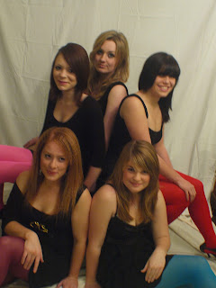
These two photos to the right are copies of a photo that i have previously shown on my blog by the Saturdays. I thought that if i tried to copy one that has already been done by a proffesional then it would look more effective. I am quite happy with these photos as you can tell they are meant to be like the one below and I think their costumes represent them to be similar too.
I think either one of these two could be used as my main image but I think I like the top one more as they all have better expressions and it looks more organised than the one to the right here.
Again these images on the left could be used either for my main image or double page spread.
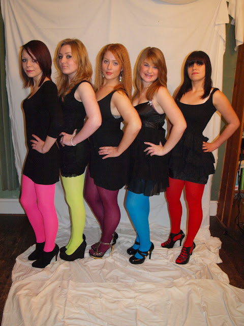
I really like these images. I like the fact that they all have a sence of similarity and the tights really stand out from the black which makes it look really effective along with the different heels.Their expressions are also similar and like many girl bands they are all represented as similar in clothes and expressions etc on pictures.
I think i prefer the one above as the girls are smiling which represents the girl band in a positive way which is what i want. I am happy with the colours and costumes as they are bold which would make the image stand out.
These 3 images on the right are the most successful out of all of my images I think. I think that one of these images would be the most effective as my main image as you have all of the girls together, all looking simialr like most girl bands do on photo shoots, the costumes look really good, expressions look effective and they are overall bold images.
I tried to take the images at different angles to create variation to see if it may look better at certain angles. I am happiest with these photos and I think the girls look their best on these.
Overall, I am really pleased with the pictures I have gained from my photo shoot. I think i got many successful images. I found a few problems whilst trying to get successful images; Lighting, space, getting people together but overall I think i have had a postive outcome. I do need to sort out my background on most of the images but other wise I think I have got the all of the images and the type of images that I need.


